


Want your walls to feel like you — not a catalog?
Look at what you already wear, collect, and do on weekends.
Those clues point to the art that will actually belong in your space.
I’ll show you how to use colors and the things you love, like travel, music, or nature, to pick art that reads like you, plus easy size and hanging rules so it looks put together.
No designer ego, just choices that make your home feel honest.
Identifying Your Personal Aesthetic to Guide Wall Art Choices
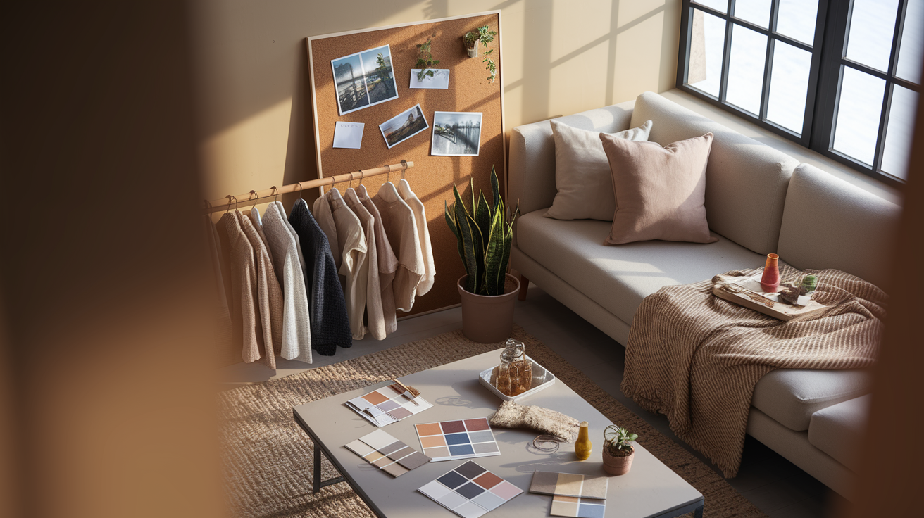
Start by looking at the spaces where you already feel comfortable. Walk through your home and notice which rooms pull you in, what furniture you bought first, and the small objects you’ve kept on display forever. Your aesthetic’s already there. You just haven’t named it yet. Check the colors that dominate your closet, the textures you grab when you’re shopping, and the patterns that make you stop scrolling. If your wardrobe’s all clean lines and neutrals, your design taste probably is too. If you’re always collecting vintage stuff or layering blankets and pillows, that’s a different direction entirely.
What you actually do when you’re not working matters more than you’d think. Do you hike, garden, cook, travel, read, or have people over constantly? The stuff that fills your weekends points straight to the art that’ll feel right on your walls. Someone who loves being outside will want botanical prints or landscapes. Frequent travelers might go for maps, cityscapes, or photos from trips they can’t stop talking about. If music’s your thing, framed album covers or abstract pieces with rhythm make sense. Pick art that connects to your real life, not some magazine version of how a room’s supposed to look.
Build a thread of continuity by choosing two or three elements you want to carry through your main rooms. Could be a shared color palette, a repeated subject like plants or buildings, or just a consistent mood. Everything doesn’t need to match perfectly. But without some kind of through line, your place ends up looking like a random garage sale. If your living room’s full of warm earth tones and organic shapes, carry that same feeling into the hallway or bedroom with similar textures or colors that play nicely together.
- Notice which rooms feel most like you and figure out what they have in common.
- List three things you do most when you’re not working.
- Pick two color families that keep showing up in your clothes, furniture, or favorite corners of your home.
- Decide if you want visual calm (soft, simple, minimal) or visual energy (bold, layered, lots going on).
- Find one or two recurring themes that feel emotionally steady to you (nature, travel, music, architecture).
- Set a loose feeling goal for each main room (relaxing, inspiring, cozy, social).
Mapping Personality Traits to Wall Art Styles and Mediums
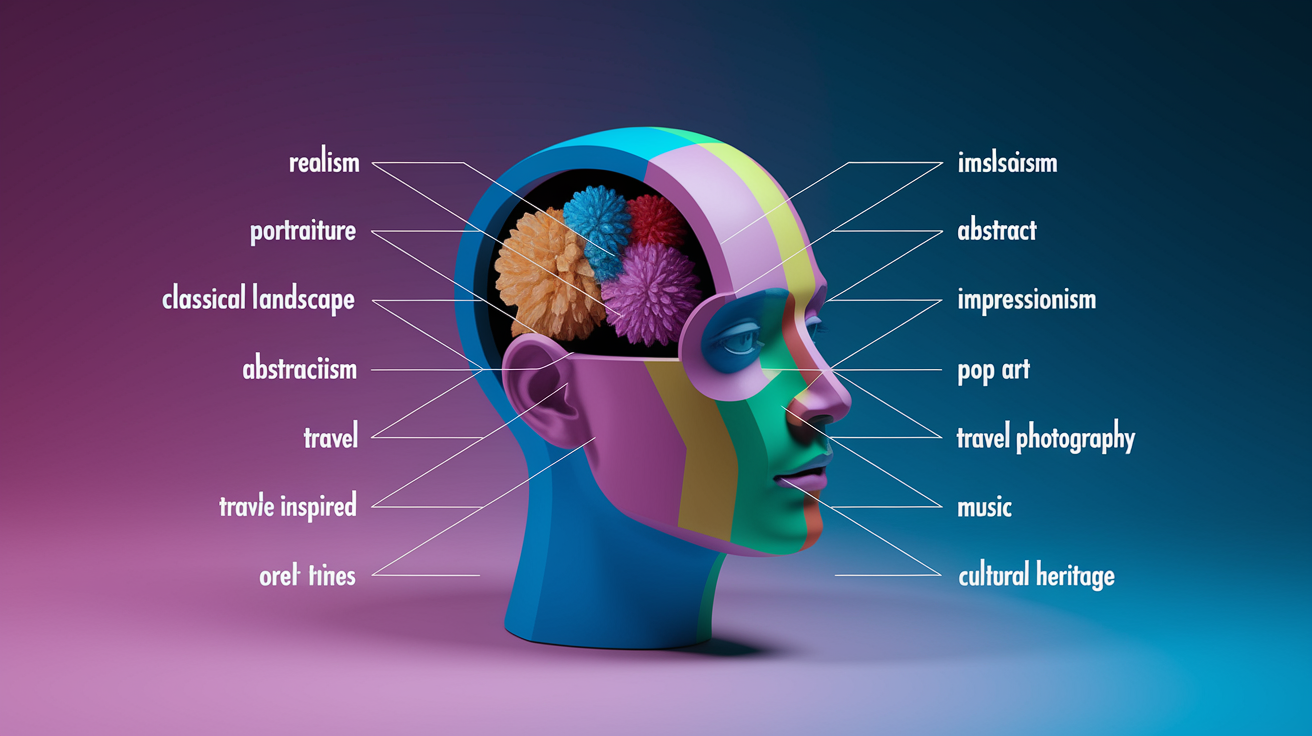
Connecting Personality to Art Genres
Once you know your core aesthetic, match it to specific art genres that naturally express those traits. Traditionalists who care about structure and timeless design feel right at home with realism, portraiture, or classical landscapes. Clear subjects, careful composition. Creative types and experimenters want abstract art where interpretation stays open and the work invites you in instead of telling you what to think. Dreamers and romantics tend to choose impressionism or soft, atmospheric pieces that capture spontaneous beauty and emotional mood over sharp detail. If you’re contemporary and vibrant, pop art, bold graphic prints, or culture-forward imagery with saturated color will feel right.
Nature lovers almost always go for botanical prints, wildlife photography, or calm landscapes that bring the outdoors inside. Travelers lean toward maps, vintage travel posters, or their own photography from trips that mattered. Music people display framed album covers, typographic lyrics, or soundwave art that turns favorite songs into visuals. If culture or heritage matters to you, folk patterns, traditional textiles, or regional art that honors family roots makes the most sense.
Choosing the Right Medium
The material your art’s printed or made on changes how it feels in a room. Canvas gives you a non-reflective, textured surface that works well for large focal pieces and brings a gallery vibe to contemporary or transitional spaces. It softens light and adds warmth. Acrylic and glass deliver high color saturation and a polished, luminous clarity that suits sleek modern rooms where you want the art to feel crisp. Metal and mixed media pieces introduce dimensional texture and shadow play, especially when laser cut aluminum or steel gets combined with wood, resin, or layered textiles. These materials add architectural interest and a tactile quality that flat prints just can’t match.
- Traditionalists: realism, portraiture, classical landscapes, detailed still life.
- Creative experimenters: abstract art, mixed media collages, surreal imagery, interpretive photography.
- Dreamers and romantics: impressionism, soft watercolors, atmospheric photography, gentle florals.
- Bold and vibrant personalities: pop art, graphic prints, bold typography, saturated color blocks.
- Nature lovers: botanical prints, wildlife photography, landscape painting, earthy textures.
- Travelers: vintage maps, cityscapes, personal travel photography, cultural iconography.
- Music enthusiasts: framed album art, soundwave prints, typographic lyrics, concert posters.
- Cultural and heritage focused: folk patterns, traditional textiles, regional art, family heirlooms.
Using Color Psychology to Select Wall Art That Reflects Mood and Identity
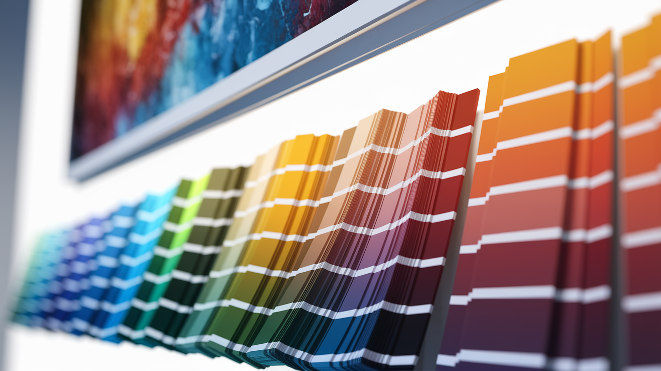
Cool tones like soft blues, muted greens, and gray blue neutrals promote calm and focus. Perfect for bedrooms, reading nooks, or any space where you need to slow down. Warm tones like amber, rust, terracotta, and deep red energize social spaces. Living rooms, dining areas, kitchens where conversation and activity happen. If you want a room to feel restful, choose art dominated by cool or neutral palettes. If you want it lively and welcoming, bring in warm, saturated colors.
Align your art with the existing color scheme using the 60-30-10 rule as a loose guide. Your walls, large furniture, and flooring usually provide the 60 percent dominant tone. Secondary colors like accent chairs, rugs, or curtains make up 30 percent. Art often delivers that final 10 percent accent, adding a pop of contrast or reinforcing a supporting hue. If your room’s mostly neutral with warm wood tones, a piece featuring a bold accent color like deep teal or burnt orange can anchor the space without overwhelming it. If your palette’s already colorful, choose art that echoes one of the existing tones to tie everything together.
Pick art based on the emotional identity you want each room to express. A bedroom meant for rest benefits from muted, earthy, or cool toned art that visually lowers the energy. A home office where you need motivation can handle bolder color and graphic shapes that keep your attention engaged. Entryways and social spaces can carry brighter, more complex palettes because people pass through them or gather there briefly. Match the artwork’s color intensity to the room’s intended function and your personal tolerance for visual stimulation.
Choosing Wall Art Sizes, Scale, and Proportions That Represent You

Getting the size right matters more than most people expect. A beautifully chosen piece hung at the wrong scale or height feels awkward. A mid-range print positioned correctly looks intentional and confident. Use the two-thirds rule when hanging art above furniture. The artwork should be roughly two-thirds the width of the piece below it. If your sofa’s 90 inches wide, aim for art that spans 55 to 65 inches, either as a single large piece or a grouped arrangement. This proportion keeps the art visually connected to the furniture without floating above it or shrinking into insignificance.
Hanging height follows a simple museum standard. Position the center of the artwork at 57 to 60 inches from the floor. This places the focal point at average eye level and makes the piece comfortable to view whether you’re standing or seated. When art hangs above a sofa, console, or bed, leave 6 to 10 inches of space between the bottom of the frame and the top of the furniture. This gap maintains the connection between the two elements while giving each room to breathe. For multi-piece arrangements or gallery walls, keep 2 to 4 inches of space between frames to preserve visual structure without crowding.
| Rule | Measurement | Purpose |
|---|---|---|
| Two-thirds rule | Art width should be ~2/3 the width of furniture below (e.g., 90″ sofa → 55–65″ art) | Keeps art proportional and visually anchored to furniture |
| Hanging height | Center of artwork at 57–60″ from floor | Positions art at comfortable eye level for most viewers |
| Spacing guidelines | 6–10″ above furniture; 2–4″ between frames in groupings | Maintains connection and breathing room; prevents crowding |
Balance visual weight by spreading larger or darker pieces across the display instead of clustering them on one side. If you’re hanging multiple works, step back frequently and adjust until the arrangement feels stable. Leaning art on shelves or mantels softens the structure and lets you experiment without committing to nail holes.
- Choosing art that’s too small for the wall, leaving it floating and disconnected from the room.
- Hanging a single piece too high, often centered on the wall rather than at eye level.
- Ignoring furniture width and picking art based only on what fits the blank space above.
Curating Gallery Walls and Multi-Piece Displays for Personal Storytelling
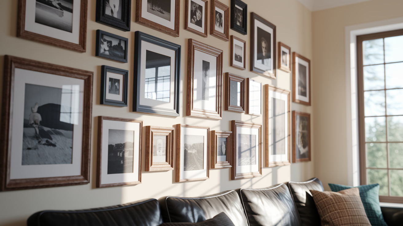
Gallery walls let you layer multiple sides of your personality into one display. The layout you choose sets the tone. A grid arrangement with uniform spacing and similar sized frames feels orderly and modern. Good for minimalist or contemporary spaces. Salon style layouts mix frame sizes and art types in a denser, more eclectic composition that works well in bohemian or traditional interiors. Symmetrical layouts anchor around a central focal piece with balanced supporting works on either side, creating calm and structure in formal or transitional rooms.
Create consistency across mixed artwork by using matching frame materials, neutral matting, or a shared color palette even when the subjects and styles vary. White or black frames with white mats unify photography, abstract prints, and typography into a single visual family. If you want warmth, use natural wood frames in the same finish across all pieces. Consistent framing lets you mix personal photos, vintage finds, art prints, and small paintings without the wall feeling chaotic.
Combine different mediums and formats to add movement and narrative depth. Pair framed photography with small abstract paintings, typographic prints, and woven textile pieces to tell a richer story than any single type of art can manage alone. Include a piece that references travel, one that reflects a hobby, and one that simply feels calming or beautiful. Lean a few smaller frames on a shelf below or beside the main gallery to soften the structure and make the display feel lived in rather than permanent and untouchable.
- Measure the wall space and lightly mark the outer boundaries of your gallery on the floor using painter’s tape to test layouts before hanging.
- Choose one anchor piece (largest or most meaningful) and position it first, either centered or slightly off center depending on your layout style.
- Select 4 to 8 supporting pieces that share at least one common element (color family, frame style, or subject theme).
- Arrange all frames on the floor in your planned layout, adjusting until spacing feels balanced and the overall shape fits the wall.
- Maintain 2 to 4 inches of space between frames to keep the gallery from feeling crowded.
- Use matching mats or frames to create visual cohesion even when mixing photography, prints, paintings, and textile art.
- Hang the anchor piece first at the correct height (center at 57–60″), then build outward, checking spacing and level as you go.
Selecting Meaningful, Personalized, or Custom Artwork

Personalized art brings a layer of meaning that mass produced prints can’t match. Displaying family photos in quality frames turns everyday memories into intentional decor. Travel photography from your own trips, especially when printed large and matted well, makes a space feel authentically yours. Custom text art lets you feature favorite quotes, song lyrics, poetry, or inside jokes in typography that matches your home’s style. Bespoke commissions from local artists or online creators give you one of a kind pieces tailored to your exact color palette, subject matter, and size requirements.
Budget strategies make personalized art accessible at multiple price points. Mix one or two higher cost original or custom pieces with affordable prints to control spending while maintaining a curated look. Many online services and local print shops offer small samples for a few dollars, letting you test colors and textures on your actual walls before committing to a full size piece. Prioritize scale and placement over price when allocating your budget. A correctly sized mid-range print hung at the right height will outperform a small expensive work placed poorly.
- Family or personal photography printed and framed to gallery standards.
- Custom text art featuring meaningful quotes, lyrics, poems, or personal mantras in coordinated fonts and colors.
- Bespoke commissioned paintings or illustrations created to match your specific palette, interests, and space dimensions.
- DIY or locally sourced pieces like framed textiles, pressed botanicals, or handmade prints that reflect hobbies and crafts you care about.
Budgeting, Buying, and Vetting Artwork That Matches Your Personality

Set a realistic budget by deciding how much you’re willing to spend per room and allocating more to high impact focal pieces in main living areas. Mix prints and posters for supporting roles with one investment piece per space to anchor the look. Scale often matters more than price. A large, well placed affordable canvas can deliver more visual weight than a small expensive original hung in the wrong spot. Reserve higher spending for materials like metal, large mixed media works, or custom commissions when those align with your aesthetic goals.
Shop safely by reviewing return policies, asking about print quality and edition limits, and checking reviews or ratings when buying online. Look for sellers who specify materials, printing methods, and whether pieces are hand finished or mass produced. Some sites offer introductory discounts or sample pricing to help you test options before buying full size works. Authentication matters more as price increases. For original art or limited editions, ask for provenance details, artist signatures, and certificates when applicable.
| Art Type | Typical Cost Range | Best For |
|---|---|---|
| Prints and posters | Low to moderate | Supporting pieces, gallery walls, renters, experimenting with style on a budget |
| Canvas art | Moderate | Focal pieces in living rooms and bedrooms; adds texture and gallery feel |
| Metal and mixed media | Moderate to high | Statement pieces in modern or industrial spaces; dimensional texture and durability |
| Custom commissions | High | One of a kind investment pieces; personalized subjects, exact color/size match, meaningful heirlooms |
Final Words
Start by naming what feels like you, the colors you reach for, the memories you want on the wall, and the mood you want in each room.
Match those cues to art styles and materials, use color to set mood, and measure walls so pieces fit. Plan a simple gallery, mix originals with prints, and pick pieces that tell a story.
You now know how to choose wall art that reflects your personality. Small steps add up, and your walls will start to feel like home.
FAQ
Q: How do I choose wall art that reflects my personality?
A: Choosing wall art that reflects your personality starts with spotting your interior preferences, emotional tone, and favorite themes, then pick pieces that repeat colors, subjects, or materials to keep rooms cohesive.
Q: What personal-style clues should I look for to pick artwork?
A: Personal-style clues to pick artwork include favorite colors, preferred mood (calm or bold), travel memories, nature interests, music or hobbies, and preferred textures or materials.
Q: How do I match my personality to art styles and mediums?
A: Matching your personality to art styles and mediums means picking genres that echo your traits—realism for traditional, abstract for experimental, pop for lively—and materials (canvas, acrylic, metal) that set the room’s tone.
Q: How should I use color when choosing art to reflect mood?
A: Using color when choosing art to reflect mood means warm tones like amber and red energize social spaces, cool blues and greens calm, and use the 60‑30‑10 rule so art acts as the 10% accent.
Q: What size and placement rules make art look intentional?
A: Choosing size and placement that look intentional uses the two‑thirds rule (art about two‑thirds the width of furniture), hang centers at 57–60 inches, and keep spacing 2–4 inches between frames or 6–10 inches above furniture.
Q: How do I design a gallery wall that tells my personal story?
A: Designing a gallery wall that tells your story starts with a layout (grid, salon, or symmetrical), unifying frames or mats, spacing 2–4 inches, and mixing photos, prints, and woven textures for movement and depth.
Q: What personalized or custom artwork options should I consider?
A: Choosing personalized or custom artwork options includes family photos, travel maps or prints, custom text or lyrics art, and commissioned pieces from local artists, plus mixing originals with affordable prints.
Q: How do I budget and buy art that matches my personality?
A: Budgeting and buying art that matches your personality means mixing affordable prints with one investment piece, checking return policies and editions, prioritizing proper scale over price, and testing samples when possible.