


Think local art will make a tiny living room feel cluttered? Think again.
With the right size, color, and placement you can showcase neighborhood artists and keep the space airy.
Start by measuring the wall and furniture, pick art about two-thirds the width of the sofa, and favor slim frames or one strong piece over a messy cluster.
This post walks you through simple, budget-friendly choices, from scale and color to lighting and where to find authentic local work, so your small room feels curated, not crowded.
Selecting Artwork Size and Scale for Small Living Rooms

Measure your wall space first. Grab a tape measure and write down the width and height of the open area you’re planning to fill. Then measure the furniture sitting below that spot. If you’re hanging something above a sofa, note how wide the sofa is.
A solid starting point is choosing artwork that’s roughly two-thirds the width of whatever’s underneath. A 60-inch sofa works well with art around 40 inches wide. A 72-inch sofa looks balanced with a piece close to 48 inches across. Vertical pieces do wonders in rooms with low ceilings because they pull the eye upward and make the space feel taller. Think 18″ x 36″ or 24″ x 48″ instead of something wide and horizontal.
If you’re drawn to several smaller pieces from local artists rather than one large work, that’s totally fine. Just keep the overall footprint of the grouping within that two-thirds guideline. Space individual pieces 2 to 3 inches apart so the cluster reads as one unit, not a bunch of scattered frames. Quick size and placement tips:
- Width ratio: Aim for art that’s about 66% the width of the furniture below it.
- Measure wall space: Write down height and width, then subtract trim or any obstructions.
- One large vs. several small: Go with one statement piece for simplicity or group 3 to 7 small pieces for more visual interest.
- Spacing: Leave 2 to 3 inches between frames in a cluster. More than 4 inches and it starts looking disconnected.
- Height guidelines: Hang art 6 to 12 inches above sofa backs, 4 to 6 inches above mantels, or center the piece at 57 to 60 inches from the floor if the wall is clear.
Choosing Local Art Based on Color Palette and Room Mood
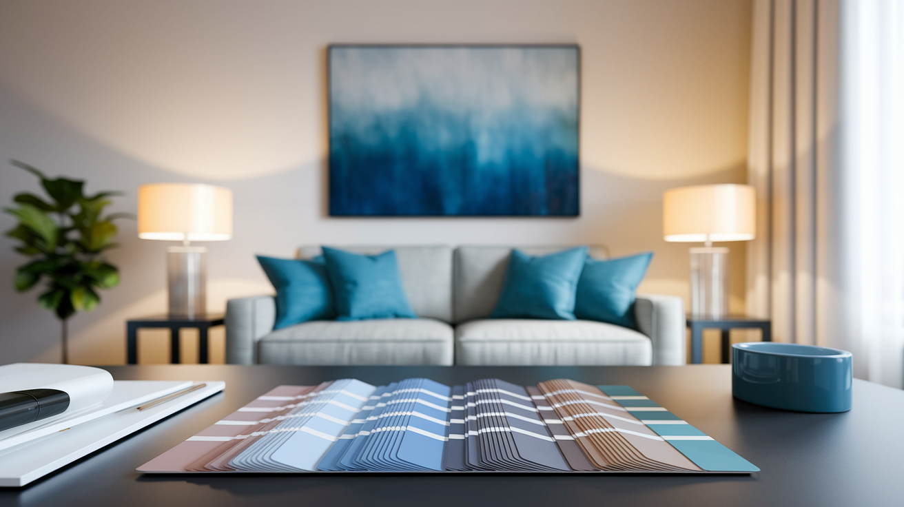
Start by matching artwork colors to what’s already in the room, or deliberately contrast them if you want a focal point that adds energy. Light and neutral palettes keep small rooms feeling open. Soft grays, warm whites, muted blues, sandy earth tones. Bold colors can work as accent pops, but use them sparingly. A single bright piece in a room of neutrals creates energy without tipping into chaos.
Local artists often pull inspiration from regional landscapes, weather, and natural light conditions, which means their color choices might already fit the lighting in your home. Coastal artists lean toward blues and sandy tones. Artists in wooded areas favor greens, browns, seasonal golds. If your small living room gets strong afternoon sun, cooler tones like blue, green, or lavender can calm the warmth. If your room tends dim or faces north, warmer tones like amber, terracotta, or peach add coziness without shrinking the space.
Monochrome or tonal artwork in shades of one color family creates a refined, cohesive look that doesn’t chop up the wall visually. If you want more contrast, stick to complementary colors but keep one as the dominant tone and the other as an accent.
Placement Techniques for Local Art in Compact Living Spaces
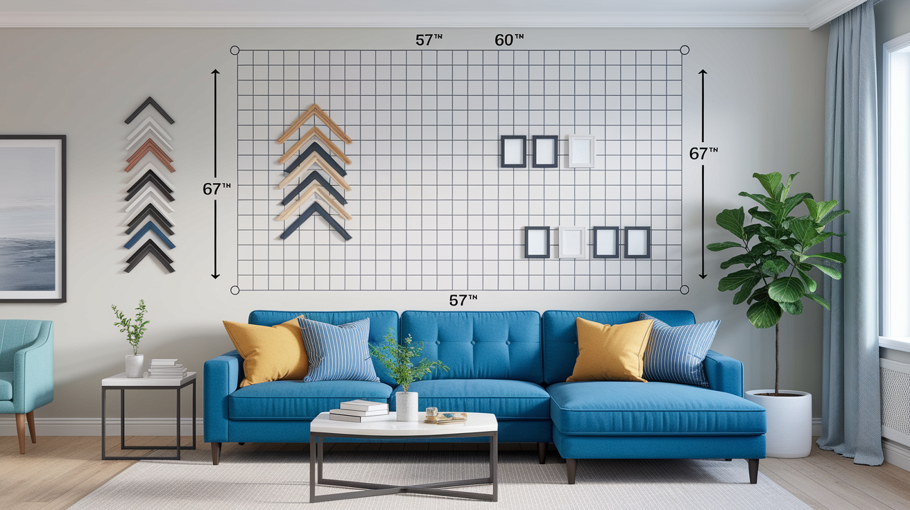
The standard hanging height is centering the artwork at 57 to 60 inches from the floor. That’s eye level for most people. In small rooms you can hang slightly higher to pull the eye upward and suggest taller ceilings, but don’t go so high that you’re craning your neck.
Here are four placement strategies that preserve flow and prevent clutter:
- Stick to eye-level rules. Center the piece at 57 to 60 inches. If you’re hanging above furniture, measure 6 to 12 inches above the top of the sofa or chair back instead.
- Use vertical layouts to elongate. Stack smaller works vertically to make the wall appear taller. Works especially well on narrow walls or beside doorways.
- Balance around windows. If the room has a window, don’t place art directly next to it. Leave breathing room or hang on the adjacent wall so the art doesn’t compete with natural light or get washed out.
- Avoid cluttered corners. Don’t cram art into tight corners or behind furniture. If a piece isn’t visible from the main seating area, move it to a more open wall or skip it.
Asymmetrical arrangements add casual interest but only if you leave enough negative space around each piece. Too many frames squeezed together make a small room feel cramped.
Frame Styles and Materials That Enhance Local Artwork
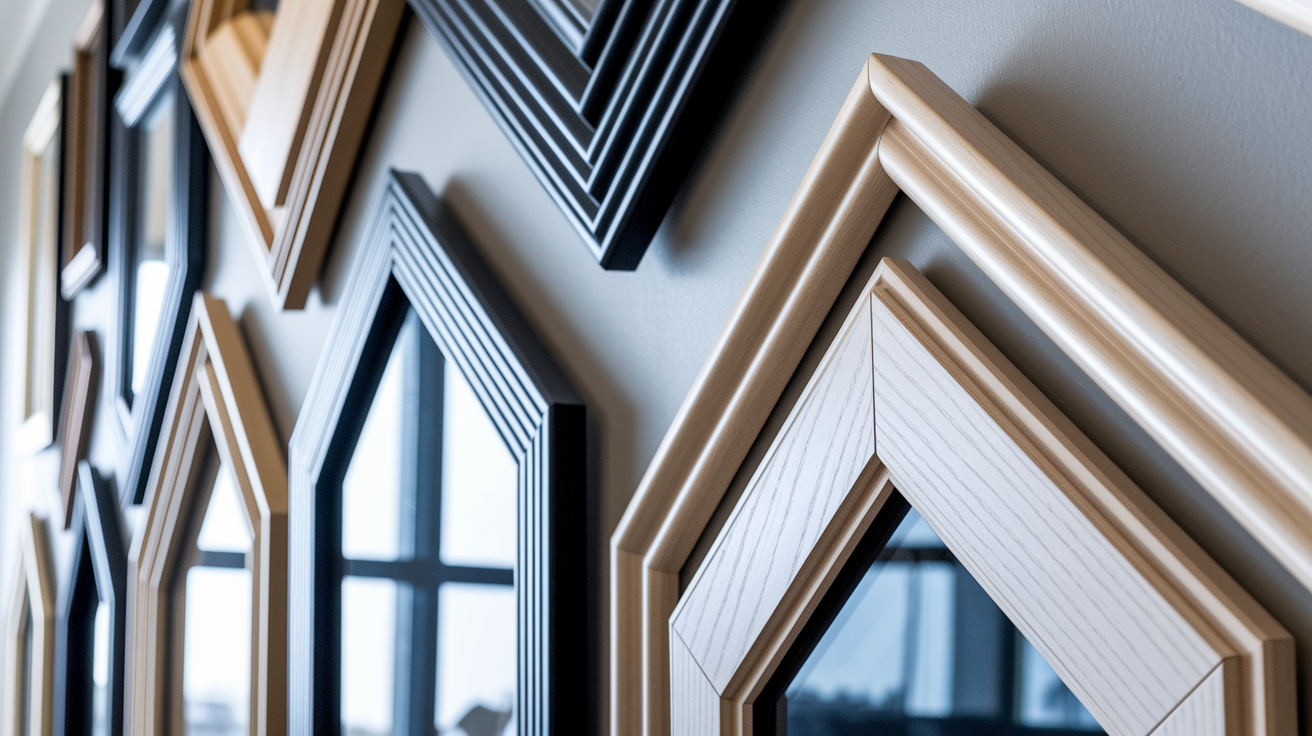
Choose thin frames or frameless mounts to keep the visual weight low. Wide, ornate frames can shrink the perceived size of the room. Natural wood in light tones blends seamlessly with most small spaces. Thin metal frames in black, white, or brushed brass offer a clean, modern edge without bulk.
Floating frames add a bit of depth because the artwork sits slightly forward from the wall, but the profile stays slim. Works well for canvas or panel paintings. If the local piece is already on stretched canvas, going frameless is an option. It keeps the look contemporary and uncluttered.
Dark frames add definition and contrast, but use them carefully in compact rooms. A single dark frame on a light wall can anchor a focal point. Too many dark frames scattered around a small room will start to feel heavy. If you’re grouping several pieces, stick to one frame color or finish across the set. Mixing frame styles is fine if you have a large room, but in a small living room it can look chaotic fast.
Creating Gallery Walls vs. Using a Single Statement Piece

A gallery wall works when you curate it tightly. In a small room, aim for a focused cluster of 3 to 7 pieces rather than a sprawling collection. Arrange them vertically to emphasize height or in a balanced grid for a more formal feel. Start by laying the pieces out on the floor. Move them around until the grouping feels balanced. Then transfer that layout to the wall, keeping 2 to 3 inches of space between frames. If you go asymmetrical, anchor the arrangement around one larger or bolder piece and let the smaller works orbit it.
A single statement piece brings simplicity and calm, which often feels better in a small space. One well-chosen local painting or print above the sofa or fireplace gives the room a clear focal point without competing for attention. It’s easier to hang, easier to light, and easier to swap out later if your taste shifts. The tradeoff is less opportunity to showcase a variety of local artists at once.
| Approach | Best For |
|---|---|
| Gallery wall (3–7 pieces) | Showcasing variety; adding texture and interest; vertical arrangements in narrow rooms. |
| Single statement piece | Creating calm and focus; simplifying layout; highlighting one standout local work. |
| Two-piece pairing | Balancing symmetry above a sofa; pairing complementary themes or colors; testing gallery-wall skills on a smaller scale. |
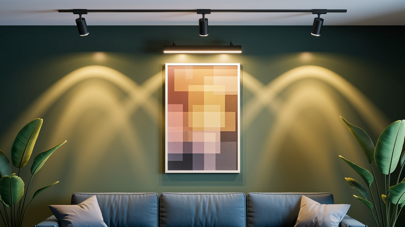
Lighting Strategies to Highlight Local Art in Small Spaces
Good lighting makes the difference between art that pops and art that disappears. Natural light is free, but direct sun can fade pigments over time. If your artwork gets strong daylight, consider UV-protective glass or move the piece to a wall with indirect light.
Artificial lighting gives you control. Three common options:
- LED picture lights: Mount a slim fixture to the top of the frame or wall above it. LEDs stay cool and won’t damage the work. Aim for warm 2700K to 3000K color temperature in living rooms.
- Adjustable track or ceiling spots: Angle the beam at roughly 30 degrees to reduce glare. Keep the fixture 1.5 to 3 feet from the artwork depending on intensity.
- Recessed accent lights: If you’re renovating, recessed cans with directional trims let you spotlight art without visible fixtures. Use dimmers to adjust mood and prevent harsh brightness.
Don’t aim light straight down from directly overhead. It casts shadows and flattens texture. A slight angle from above or the side brings out brushstrokes, canvas weave, and color depth.
Where to Find Local Artists and Authentic Regional Artwork

Local galleries are the most straightforward starting point. Many towns have cooperative galleries where artists share display space and take turns staffing the shop. You’ll meet the artists in person and hear the stories behind the work. Community art centers often host rotating exhibits and artist receptions. Show up on opening night for the best selection and a chance to talk before pieces sell.
Seasonal art fairs and weekend markets are goldmines for affordable local work. Artists bring smaller, unframed pieces that fit tight budgets and small walls. You can usually negotiate or ask about payment plans. Open studio events let you visit artists’ workspaces, see work in progress, and commission custom sizes. Search for local studio tours in spring and fall.
Online options are growing:
- Local artist directories: Regional arts councils and cultural websites maintain searchable lists with links to portfolios and contact info.
- Social platforms: Search Instagram or Facebook using your city name plus “artist” or check location tags on posts. Message artists directly to ask about available work.
- Local online marketplaces: Some cities have digital co-ops or Etsy-style platforms focused on homegrown creators. Shipping is faster and cheaper when the artist is nearby.
- Community bulletin boards: Coffee shops, libraries, and indie bookstores often have flyers or cards from local painters, printmakers, and photographers.
Budgeting and Practical Tips for Buying Local Art

Set a rough budget before you start browsing. Knowing your limit helps you focus and prevents impulse buys that don’t fit the space.
Follow these steps to stretch your budget:
- Start with prints. Limited-edition prints or giclées cost less than originals but still support the artist. Ask about edition size. Smaller editions, under 50, hold more value.
- Buy direct. Skip the gallery markup when possible. Contact artists through their websites or social channels to negotiate a fair price.
- Look for emerging artists. Newer or less-established creators often price small originals in the low hundreds. You get unique work at a friendlier cost.
- Ask about payment plans. Many local artists accept installment payments, especially for pieces over a few hundred dollars.
Small-scale originals are often less expensive than you expect. A local painter might charge $200 to $600 for a 16″ x 20″ canvas, depending on medium and detail. Compare that to a mass-market print in a big-box frame, which can run $150 to $300 but lacks any connection to your community or the artist’s hand. If budget is tight, buy one meaningful small piece now and add to your collection over time. Rotating what’s on display through a picture ledge or shelf also lets you swap pieces seasonally without committing wall space or making new holes.
Final Words
Pick the right scale and placement first, hang art 4-8 inches above furniture and keep pieces about two-thirds the width of what’s below. Match tones to your room’s light and choose thin or floating frames so walls feel open.
Use vertical groupings, smart lighting, and either a single statement piece or a curated gallery depending on space and budget. Shop local markets, galleries, or buy prints for affordable finds.
If you’re still wondering how to choose local art for small living rooms, start small, edit often, and enjoy the results.
FAQ
Q: What is the 3-5-7 rule in interior design?
A: The 3-5-7 rule in interior design is a visual rhythm guide: use three large items, five medium pieces, and seven small accents to create balanced, layered groupings that feel natural and lived-in.
Q: What is the 70 30 rule in art?
A: The 70 30 rule in art suggests using 70 percent dominant tones and 30 percent accents; the 80/20 variant uses 80 percent base and 20 percent accents for stronger contrast and a focal point.
Q: What is the 2/3 rule for living rooms?
A: The 2/3 rule for living rooms says artwork should be about two-thirds the width of the sofa or furniture below it, hung 4–8 inches above, for balanced scale and cohesive visual weight.